


Odido is a Dutch telecom brand born from the merger of T-Mobile and Tele2. I helped refine its Brand New Identity and led the design of the Odido Brand Portal, a digital guide that turns complex guidelines into a clean, intuitive experience. Working closely with designers, developers, and external agencies, we delivered a result the client described as “the icing on the cake and absolutely awesome.”

Role: Lead Product Designer (UX/UI)
Tools used: Miro, Figma, Adobe Creative Cloud tools
For more detail, view the Digital Brand Portal via the links below, or scroll down for the full case study.
Odido Brand Portal


Odido Rebranding
Human, forward-thinking, and optimistic. Odido is premium for everyone.

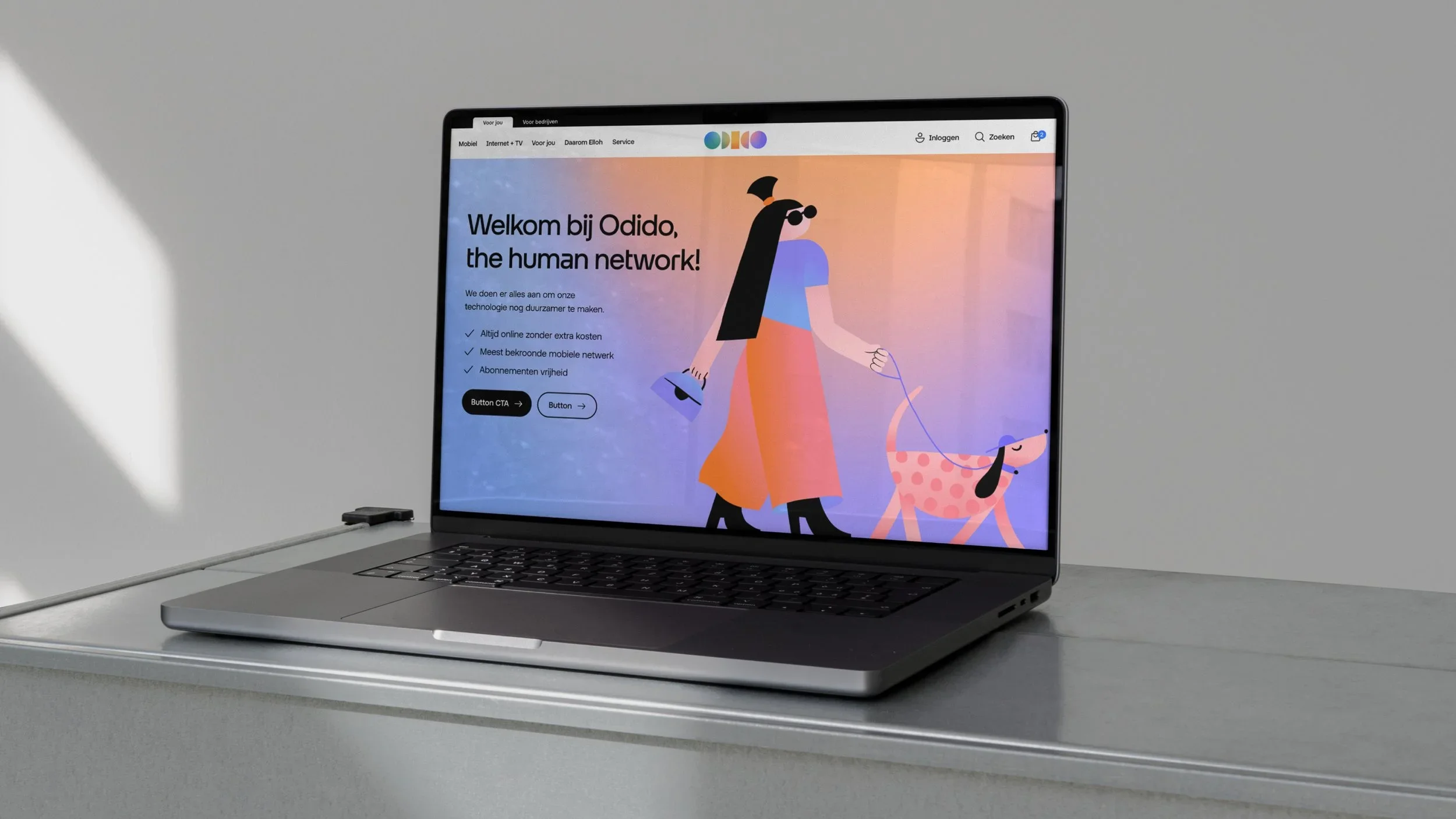
Odido is a human-first Dutch telecom brand, designed to make technology more enjoyable and accessible.
Built around openness, participation, and optimism, it challenges traditional telecom norms while offering mobile, fiber, and TV services.
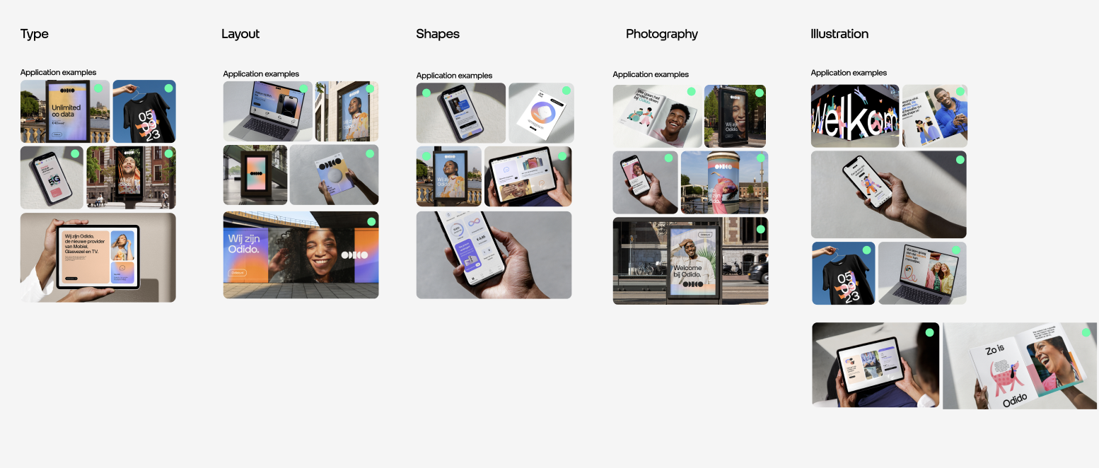
The playful logo, colourful gradients, expressive letterforms, and illustrations reflect unity in diversity, creating a warm, inclusive, and premium brand. Guided by the principle of “premium for everyone,” Odido balances maturity with playfulness, and clarity with character.
Many talented teams contributed to this project, from TBWA/Neboko and Senior Designer Nastasia Broutin, to creative agencies
like BUCK and CoType™ (Diana Ovezea), as well as CODE D’Azur and We Are No Heroes.


Odido Digital Brand Portal

The Challenge
Odido needed more than a new visual identity. The challenge was to help hundreds of people across teams, agencies, and partners understand and consistently apply the new brand in their daily work. Existing brand guidelines were complex, fragmented, and hard to navigate, making it difficult to maintain coherence at scale.
Odido asked us to turn these rules into a clear, accessible digital portal that would make the brand easy to understand, easy to use, and easy to adopt, even for people without a design background.

The solution
We designed the Odido Brand Portal to turn complexity into clarity without diluting the strength of the new identity. The portal’s clean, restrained style lets Odido’s bold branding take center stage, while guiding users through the rules in a clear, human, and visually engaging way.
We focused on making the experience intuitive and enjoyable, transforming dense guidelines into a structured journey that feels simple, elegant, and even a little fun to explore. Every detail was carefully curated for designers, developers, agencies, and internal teams, translating complex information into clear, practical guidance and helping teams confidently use the brand without needing design expertise, while ensuring consistency across every touchpoint.
I led the Odido Brand Portal end-to-end, from structure and interface to content, working closely with Senior Designer Nastasia Broutin, who had shaped the brand from the start, and our talented team. Together, we directed the portal’s vision and execution, ensuring continuity, cohesion, and a seamless experience.

Behind the Portal Experience

The journey starts with Odido’s story and mission, followed by a playful, brand-led presentation of the logo, guiding users from vision to execution and showcasing assets and real-world applications. Below is a snapshot of the portal, along with some of the thinking behind its design and navigation.
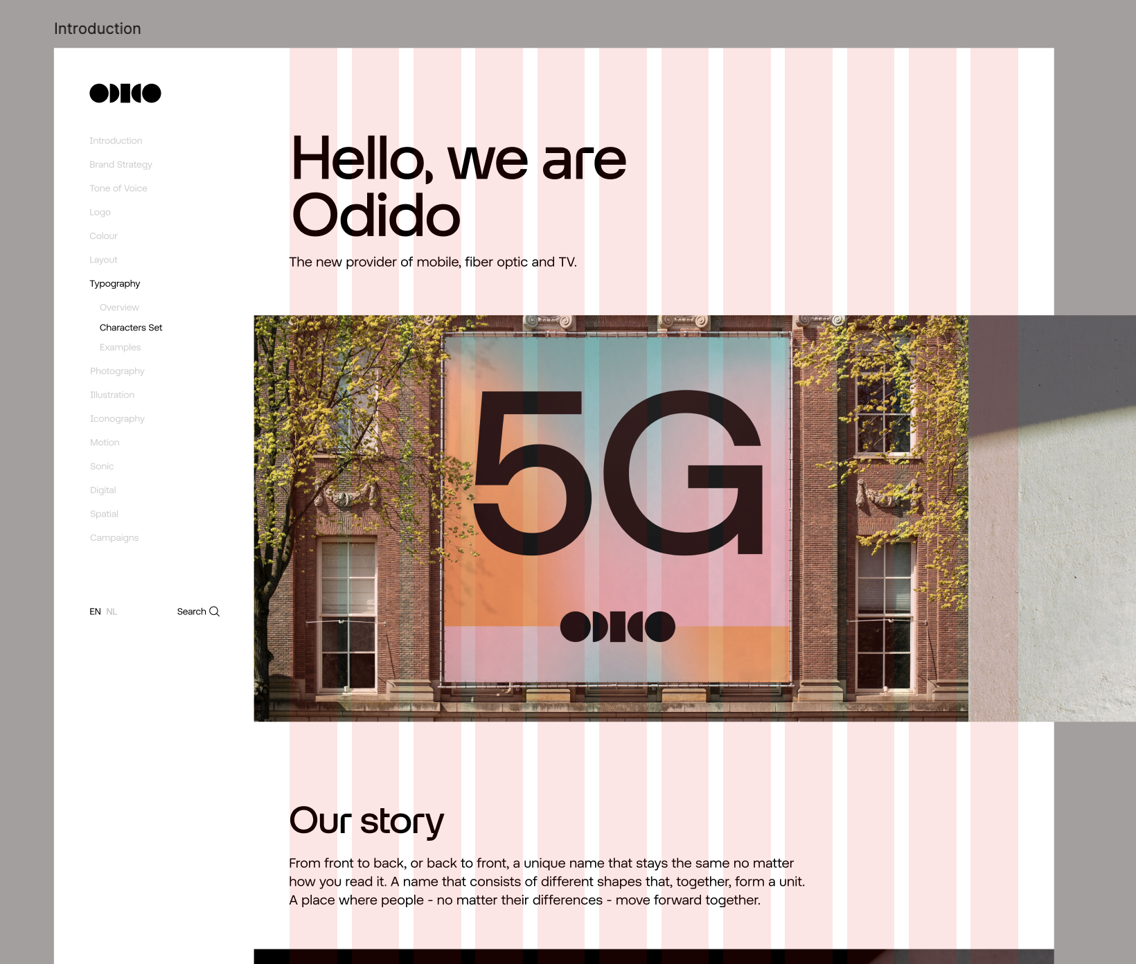
Introduction
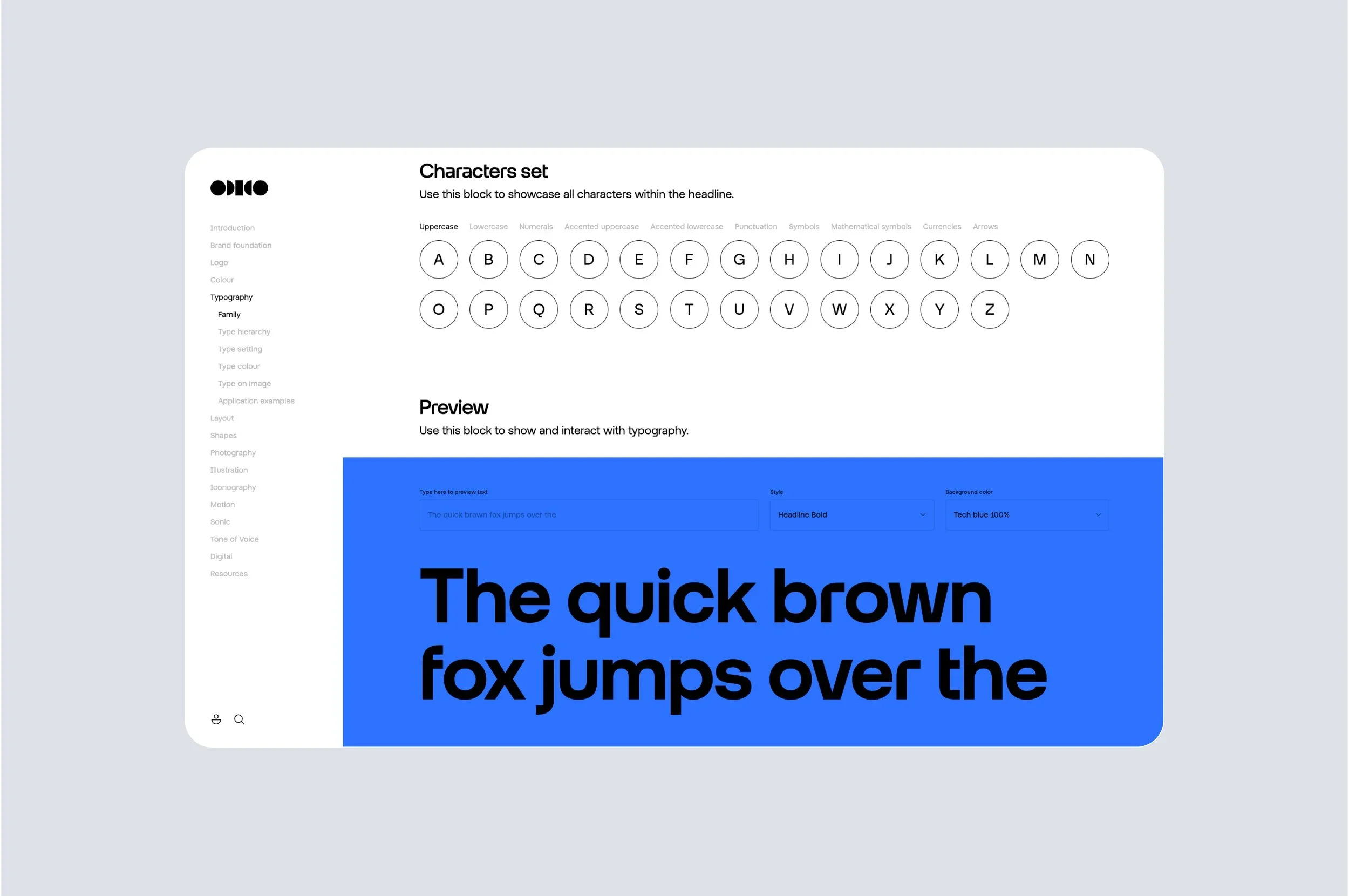
The experience starts with Odido’s story and mission. Navigation is flexible, via scrolling or a fixed side menu, while every section is designed to clearly explain each asset.
Horizontal Scrolling Gallery
To keep the layout clean and minimize vertical scrolling, we designed the image gallery to scroll horizontally.
This lets users explore visuals intuitively while maintaining a tidy, engaging look.
The Logo and Interconnected Pages
We wanted to ensure nothing was missed when explaining how to use the logo. The portal covers all four versions, from coloured to solid to masked, along with minimum sizes, clear space, and placement requirements. To make navigation intuitive, we also added buttons linking to related sections of the guidelines, ensuring users can explore the brand rules seamlessly.
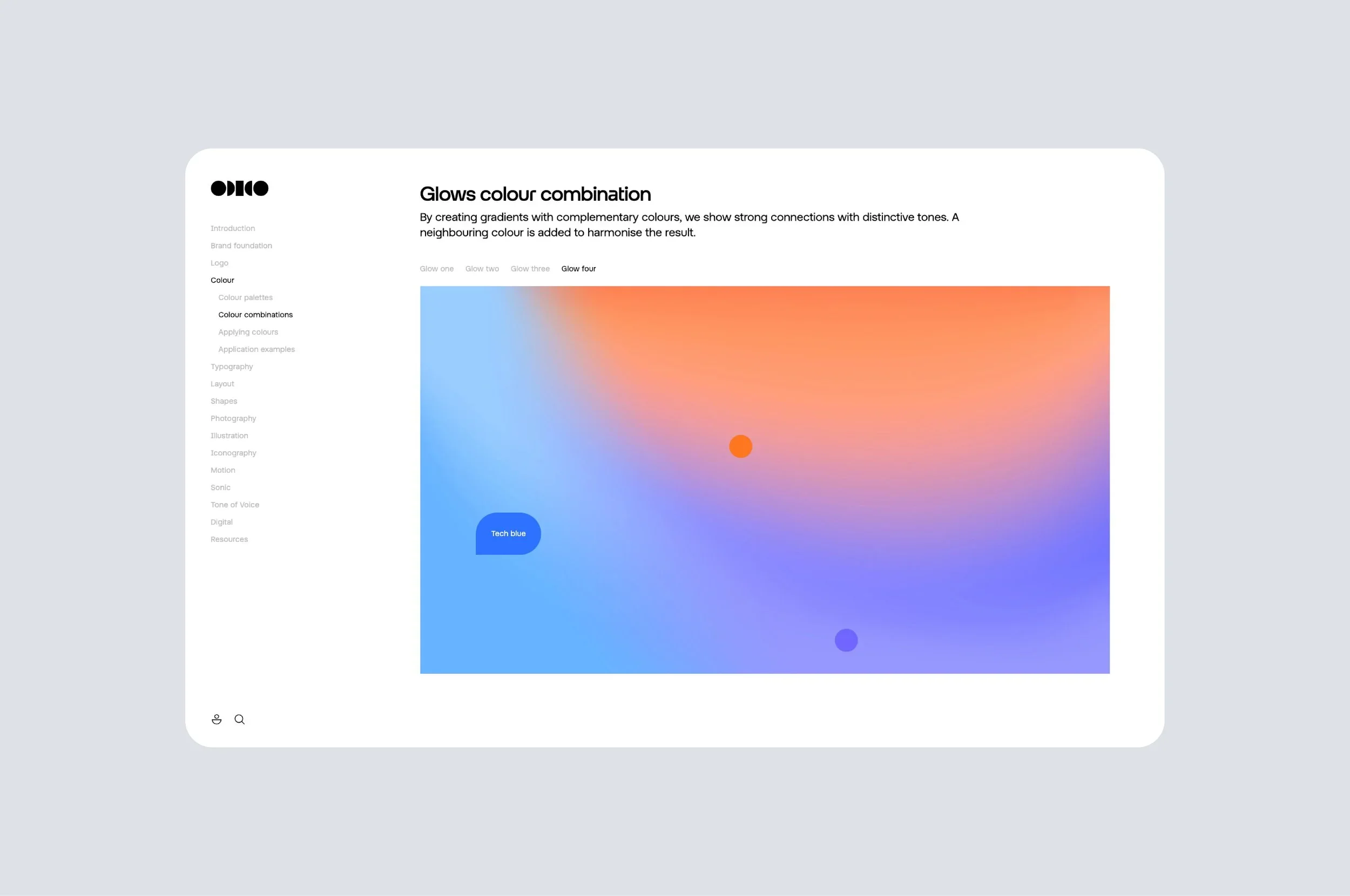
Interactive Colour Palettes
We created human-friendly, rounded palettes that let users explore colours playfully, while accessing all the info they need — from colour codes to easy copying.

Click to Explore Gradients
We created four interactive panels that let users explore the gradient’s colors by clicking on each one. Click below to experience it!

Hover Scale / Zoom Effect
Each custom letter features a responsive hover effect, allowing users to explore and appreciate the details of its design. The font was custom made by Diana Ovezea CoType.

Grid Toggle
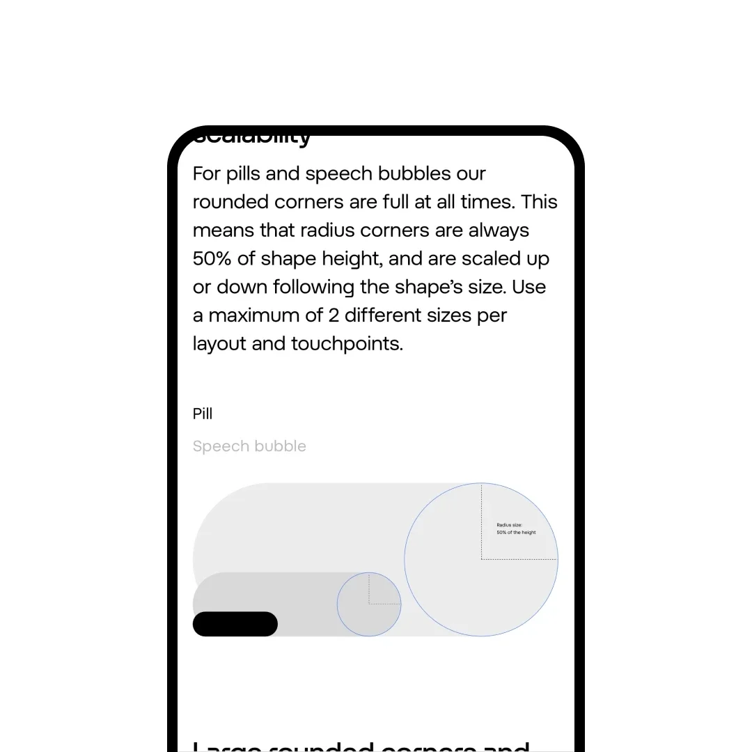
A simple, visible button lets users switch the grids on and off, helping them understand where to place elements

Step-by-Step Mirror Construction
Constructing the Mirror was a key part of shaping the layout, which is why we carefully considered how to explain it. We decided to present the process step by step, rather than all at once, allowing viewers to follow along easily and ensure the Mirror’s axis always remains visible. We used the same layout throughout, also in other sections, with clickable dots that enlarge and display descriptions on top of each image. Making the interaction more intuitive and engaging.

Character Creation Process
We let viewers glimpse our character creation process using a consistent template throughout.
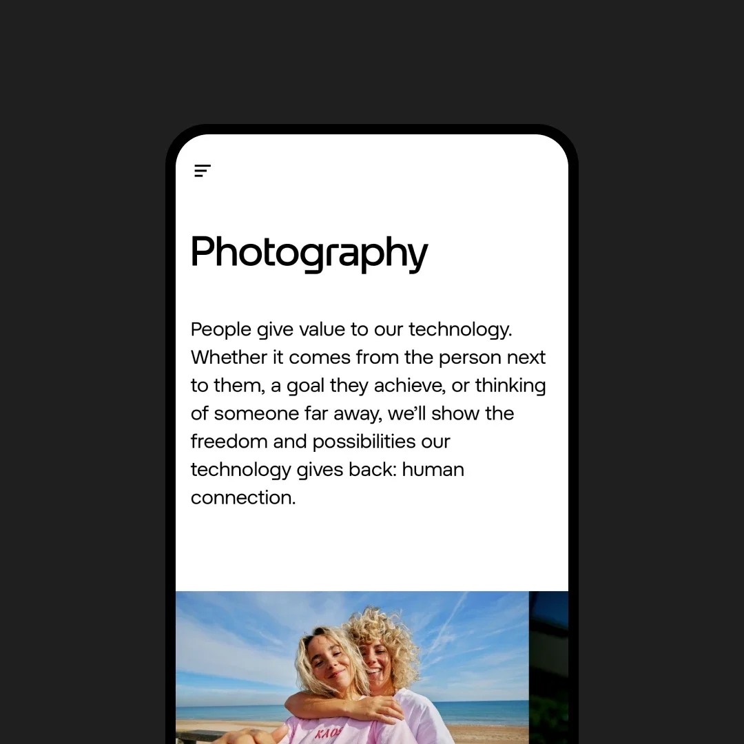
A clickable menu at the top, is always present in all sections, helping users become familiar with the format and navigate the content easily. This to create a smooth and intuitive experience. Illustrations done by BUCK Agency.

Fully responsive on mobile
The portal performs seamlessly on mobile, thanks to its versatile and clean design.

Impact & Results

Maintained a customer base of 8 million and achieved strong growth in mobile SIMs (+116,000) and broadband subscribers (+50,000 FWA by Q1 2025).
Revenue increased 1.6% to €2.3B; adjusted EBITDA grew 2.9% to €881M in 2024.
Capital expenditure rose nearly 25% to €551M to support expansion.
Over 70% of Dutch consumers recognised the brand within two months of launch.
Ranked #13 in Kantar’s Top 30 Most Valuable Dutch Brands 2024, surpassing T-Mobile’s brand equity.
Won a Gold Dutch PR Award 2024 for scale, impact, and disruptive approach.
Widely praised as a masterclass in bold, modern marketing and design, disrupting the Dutch telecom market.
Brand Office managed 1,000+ design assets; digital brand portal ensured consistent implementation and was praised as “the icing on the cake.”
Adopted by 1,200+ employees, the portal made brand assets easy to access, understand, and apply, driving consistent execution across the organisation.


Industry Feedback

LinkedIn article by Arjan Kapteijns MM RM CEO Saatchi & Saatchi NL
Risk-taking pays off, the bold strategy helped build brand equity fast.
Cross-disciplinary collaboration in a focused, confidential environment accelerates creativity and execution.
Unified rollout strengthens brand memory, changing everything at once built coherence.
UNDERCONSIDERATION.COM
The Odido rebrand has been highly praised as a standout design piece, celebrated for its bold logo, geometric and gradient-driven system, and for breaking away from conventional telecom branding. It was notable enough to be featured on Brand New, a leading platform for design critique and inspiration.


Behind the work


Creating a new identity for a brand with 8 million customers isn’t an everyday task. The goal was clear: break away from telco norms. Instead of one colour, we embraced them all, reflecting Odido’s open and inclusive character.
Geometric shapes, warm gradients, a mirrored layout system, custom typefaces, bold photography, and playful illustrations bring the brand to life. Across digital and physical touch points, Odido stands out with a human, approachable take on technology. Odido is Premium for everybody. Human, forward-thinking and optimist.
Working alongside 100+ people, we kept every product consistent through close coordination, weekly alignment meetings, and carefully sectioned work in private spaces before launch. Despite the scale, constant checks ensured readiness, making it a collaborative effort full of passion, excitement, and fun.


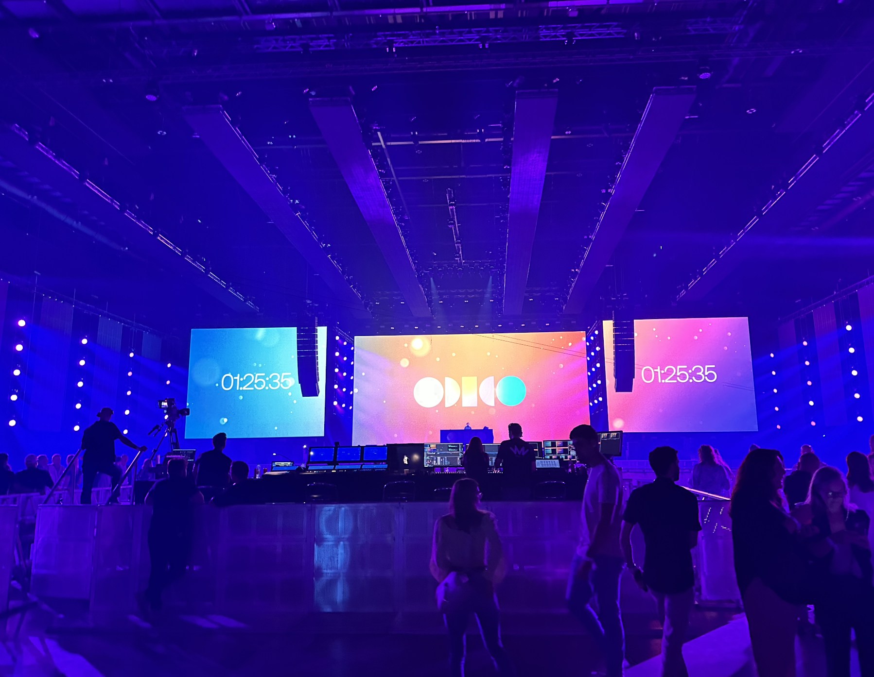
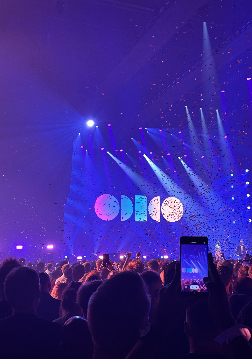
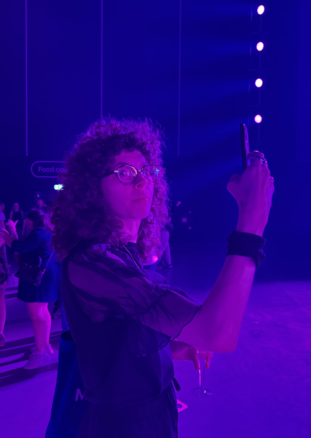
And that’s some of the people behind it and the brand launch at Ahoy venue!

Credits
Lead Agency: TBWA\NEBOKO
Visual Identity: Studio Neboko
Spatial & Interior Design: DAY Creative
Custom Typeface: CoType
Positioning: New Growth Strategies
Digital Experience: code d’azur and NoHeros
Brand Operations: VIM Group
Illustrations: BUCK
