

De Kinderboekwinkel (The Children’s Bookshop)
Reimagining the magic of your local bookshop for the digital world.
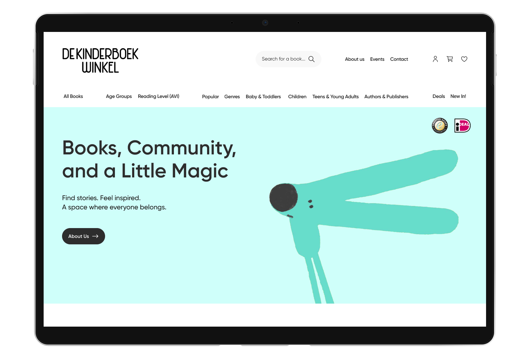
De Kinderboekwinkel, the first children’s bookshop in the Netherlands, is full of colour, charm, and expertise. Stepping into the shop feels warm, cosy, and joyful, a place that sparks imagination, makes your heart feel at home, and where you feel guided and inspired.
The challenge was bringing this same feeling, magic and seamless shopping experience online.
For this project, I redesigned the e-commerce experience to reflect that feeling, creating a more intuitive and accessible journey.

Role: Product Designer / Solo project
Timeline: 8 weeks
Tools used: Figma
Main Methodologies Used
Discover: Card Sorting, Competitive Analysis, Qualitative Interviews, Affinity Mapping, I-Statements, SUS, Card Sorting
Define: Personas, Retrospective User Journey Map, Empathy Map, User Flow Map.
Ideate: Problem Statements, HMWs, Crazy 8’s, Feature Prioritisation, User Flows, Sketches, Mid-Fidelity, Usability Testing.
Deliver: High-Fidelity Design, Design System.
For more detail, view the prototype, or research via the links below, or scroll down for the full case study.


Case Study Snapshot

The Problem: The Kinderboekwinkel, Holland first children’s bookshop, is a cosy, playful wonderland where kids can explore books and toys, guided by friendly experts who make every visit magical. Yet the website doesn’t capture the shop’s magic, isn’t fully functional and accessible, failing to meet users’ expectations.
The Solution: I designed a website that meets users’ needs for a functional, easy-to-navigate space where they can discover books, get inspired, involve their kids, and browse clearly — without losing the magic of their favourite shop.
No more getting lost searching. But how? Take a look below!
The main idea was to create a seamless shopping experience by bringing ”All Books” section onto the homepage. No more jumping between pages or feeling lost in a maze. With everything in one place and strong filtering, users stay oriented, in control, and free to explore without friction. The key is not more navigation, but a visible book section and better filtering.
All books live on the homepage, scrollable in one view.
Every top-bar click brings users to the same “All Books” section, with filters showing exactly what they want.
No more feeling lost in a maze, just a simple, intuitive experience, like browsing in-store. For example, clicking “Baby & Toddler Books” on the menu redirects to the “All Books” view already filtered for that section, making browsing intuitive.
Also some of the Key Features enabling seamless navigation and in-store feel.
The Impact: The redesign amed to an estimated 30–40% increase in online orders. The results spoke for themselves: the SUS score jumped from 52.5 (Grade F) on the original site to 90 (Grade A) on the redesign, making it extremely quick to discover, save, and buy. Users found it easy to navigate, clean, and professional.
Obstacles: Card sorting revealed most books needed multiple labels, age ranges overlapped confusingly, and the line between "Educational" and "Inspiring" consistently tripped users up — factual vs emotional learning is harder to communicate than it sounds. Usability testing confirmed what research had already flagged — and pushed further. Users struggled to determine age suitability from listings, preview images were too small to assess content quality, and early filtering felt clunky. Each issue sent the design back to be challenged and rebuilt. That cycle of pressure is what made the final system as precise and intuitive as it is.

Detailed Case Study, Empathise & Discover

What’s The Kinderboekwinkel?
I met Marlie, owner of De Kinderboekwinkel, the first children’s bookstore in the Netherlands, founded in 1975. She bought the shop years ago and transformed it into a magical hub for locals and tourists, with an extensive collection of Dutch and English children’s books, now a cornerstone of Jordan, Amsterdam’s literary scene.
The Challenge
Create an online experience for demanding book lovers who want the best books, best deals, and in-store magic, all wrapped in a seamless shopping experience.
High-Level Goals
An online bookstore that’s inspiring, intuitive, and cozy, with guidance, previews, reviews, smart filters, and seamless checkout, just like in-store. All to increase online usage.
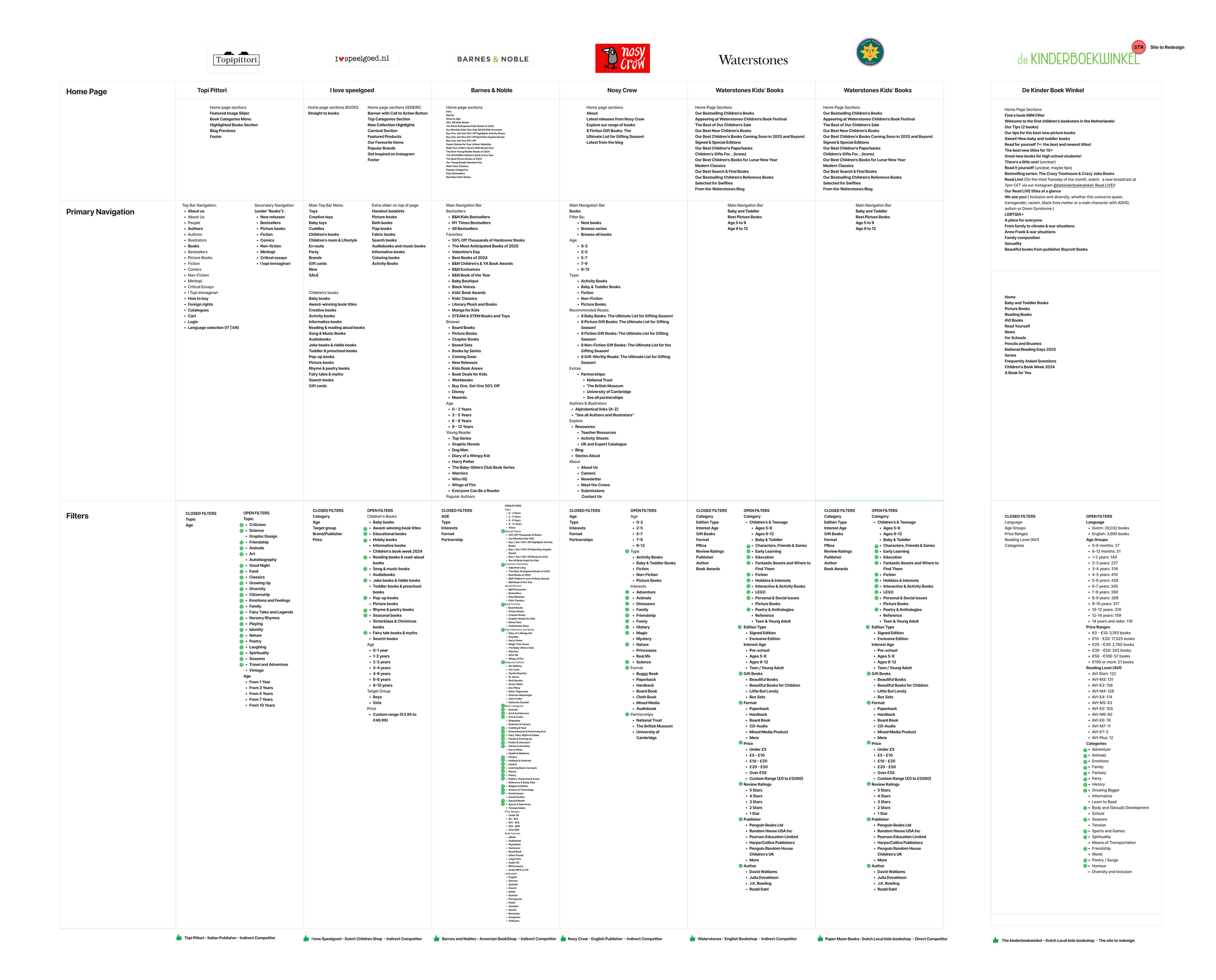
Competitor Analysis
Competitors offer strong navigation and filtering but lack clarity, accessibility, and book previews. Large chains are efficient but less curated, while smaller shops have unique, community-driven collections but weaker UX. The goal is to combine both: strong functionality with curated, character-rich experiences.
Watch the complete ‘Competitive Analysis’ at Research
Heuristic Evaluation
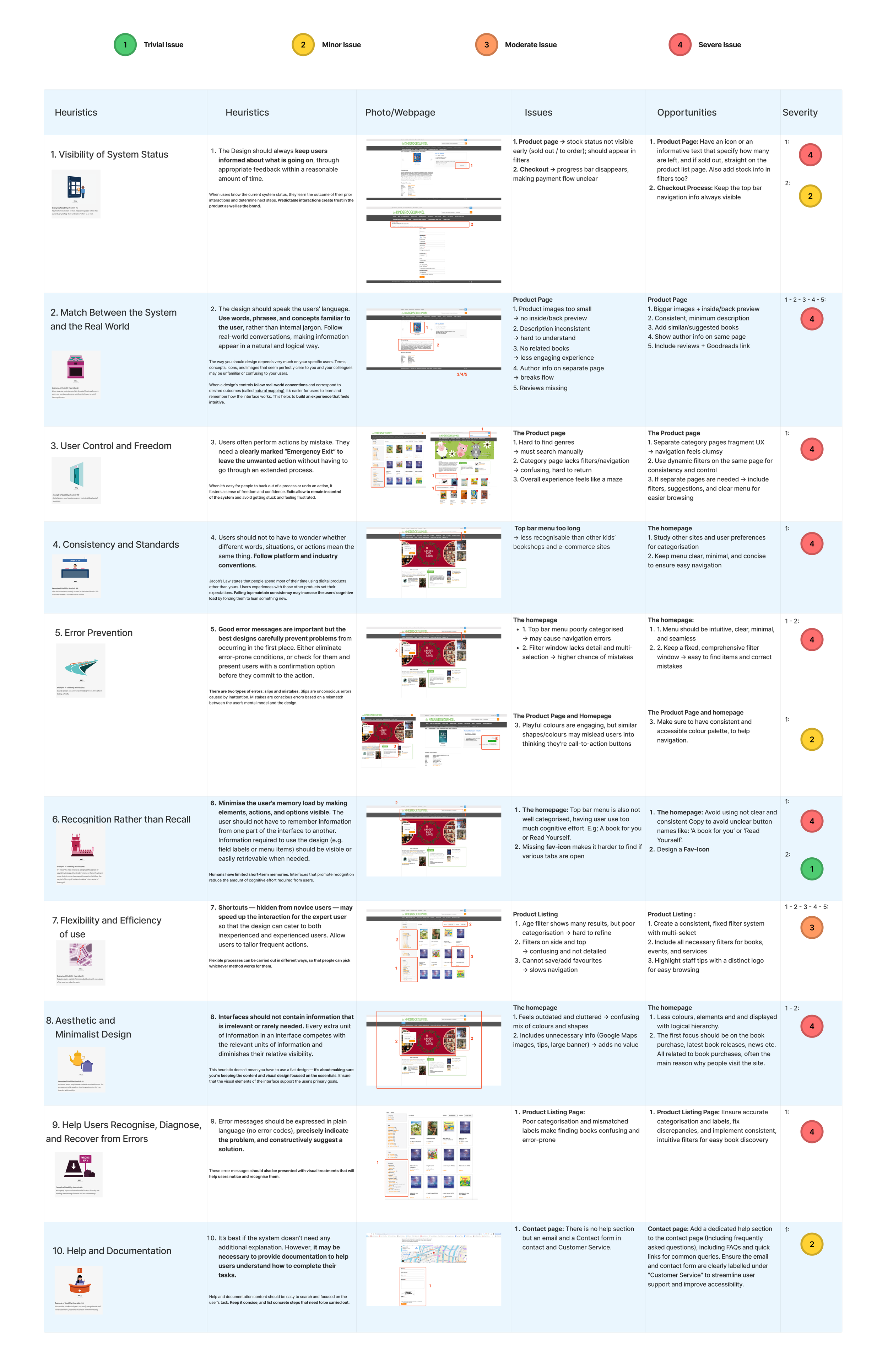
The site shows multiple high-severity usability issues caused by fragmented navigation, inconsistent structure, and low clarity across key user journeys. Each interface element was analysed to assess clarity, consistency, and ease of use, identifying key usability improvements.
Watch ‘Heuristic Evaluation’ at Research
Element Analysis
Element analysis surfaced major usability gaps and highlighted the complexity of primary navigation themes and book filtering as a key focus areas. Watch ‘Element Analysis’ and more at Research
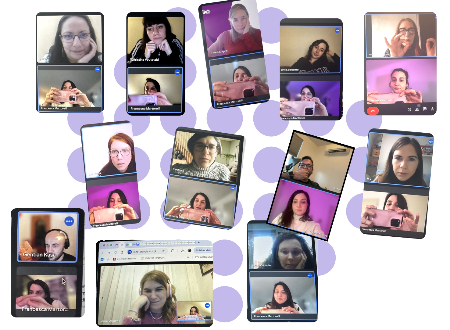
I interviewed 13 educators, children's professionals, and parents from around the world, aged 30-50 that allowed clear patterns to emerge.
Key Insights/Pain Points
Users love local online bookshops to find the best gems, but they
are forced to buy on bigger sites for trust, price, and ease.
Few expert reviews and previews reduce confidence online.
Users want their local bookstore online to be easy, inspiring, and personalised, so they can join a like-minded community, support local shops, and discover the latest rare finds and deals regularly.

Define Phase

Which problem has the most impact?
Users find it hard to shop for children’s books online, especially at De Kinderboekwinkel. They want an experience that’s easy to navigate, transparent, and inspiring — just like visiting the store.
“A seamless shopping experience would make me choose a local children’ bookshop, for curated books and to support small businesses.”
The problem is that Anna, our persona, struggles to find an easy to use, reliable, and inspiring online shopping experience due to a lack of key book details, trustworthy reviews, and seamless navigation, leaving her overwhelmed. Ultimately, Anna wants the magic of in-store book buying; feeling guided, inspired, and informed.

Who is Anna, the Careful Curator?
“Every book I choose shapes child's world, so I make sure each one is meaningful, enriching, and beautifully crafted.”

Anna’s Behaviours & Habits
Buys books online regularly
Relies on reviews from experts and parents to decide
Values educational, diverse books
Anna’s Needs & Frustrations
Recommendations to simplify choices
Previews or samples to see inside books before buying
A smooth, trustworthy buying experience
Ability to include children in purchase decisions
Too many choices, poor labelling, overwhelming experience
No clear expert guidance
Concern about costs
Navigation can be limited

Ideate and Design Phase

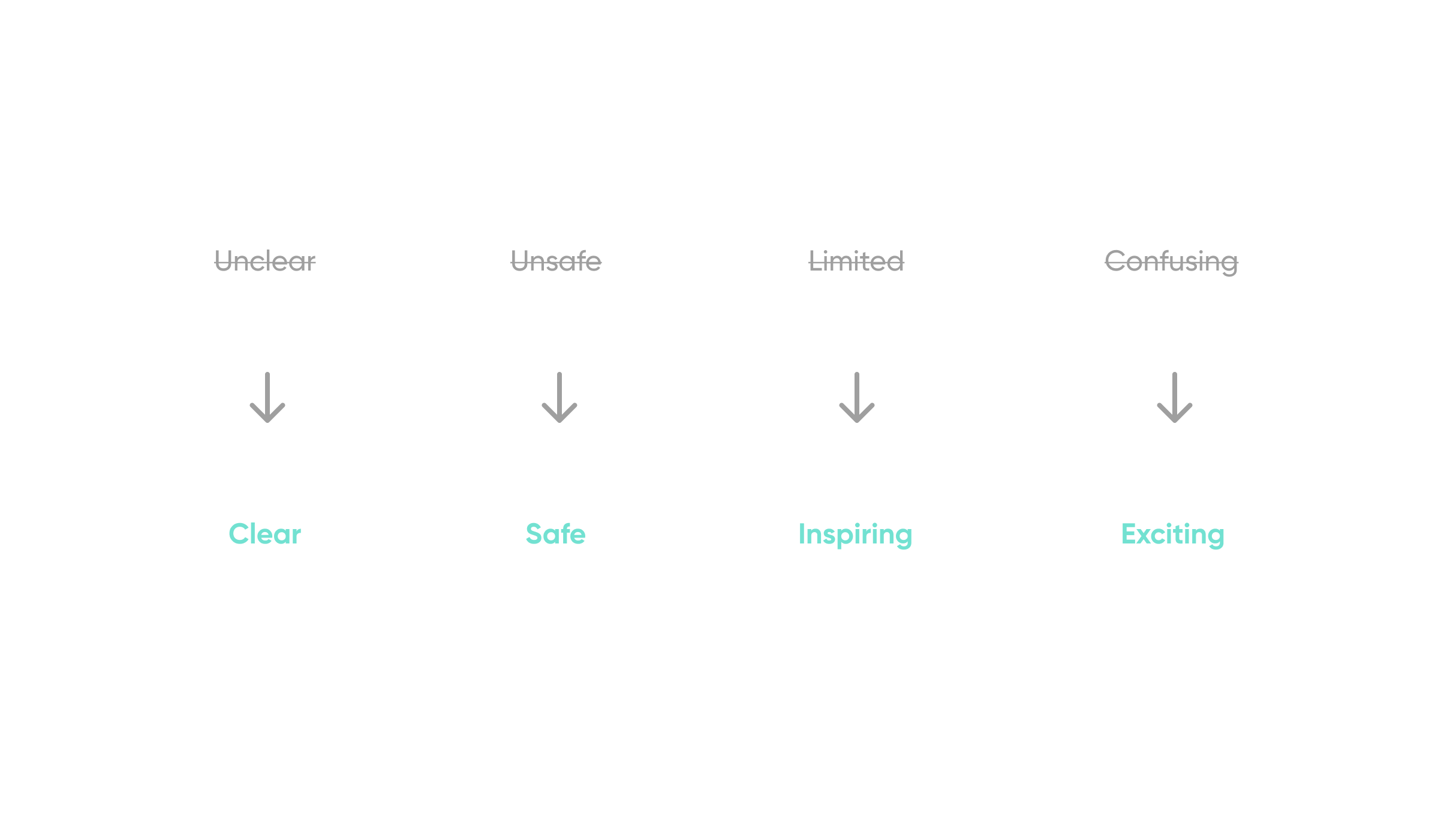
Shaping a Smarter Shopping Experience
The new Kinderboekwinkel experience should feel smooth, intuitive, inspiring, and safe yet cosy, helping users stay engaged without losing time or patience.
The Design Solutions
The main idea was to create a seamless shopping experience by bringing all books section onto the homepage. No more jumping between pages or feeling lost in a maze. With everything in one place and strong filtering, users stay oriented, in control, and free to explore without friction. The key is not more navigation, but a visible book section and better filtering.
Every top navigation entry leads to the same “All Books” view,
with filters applied to surface only relevant results.
Before and After Comparison
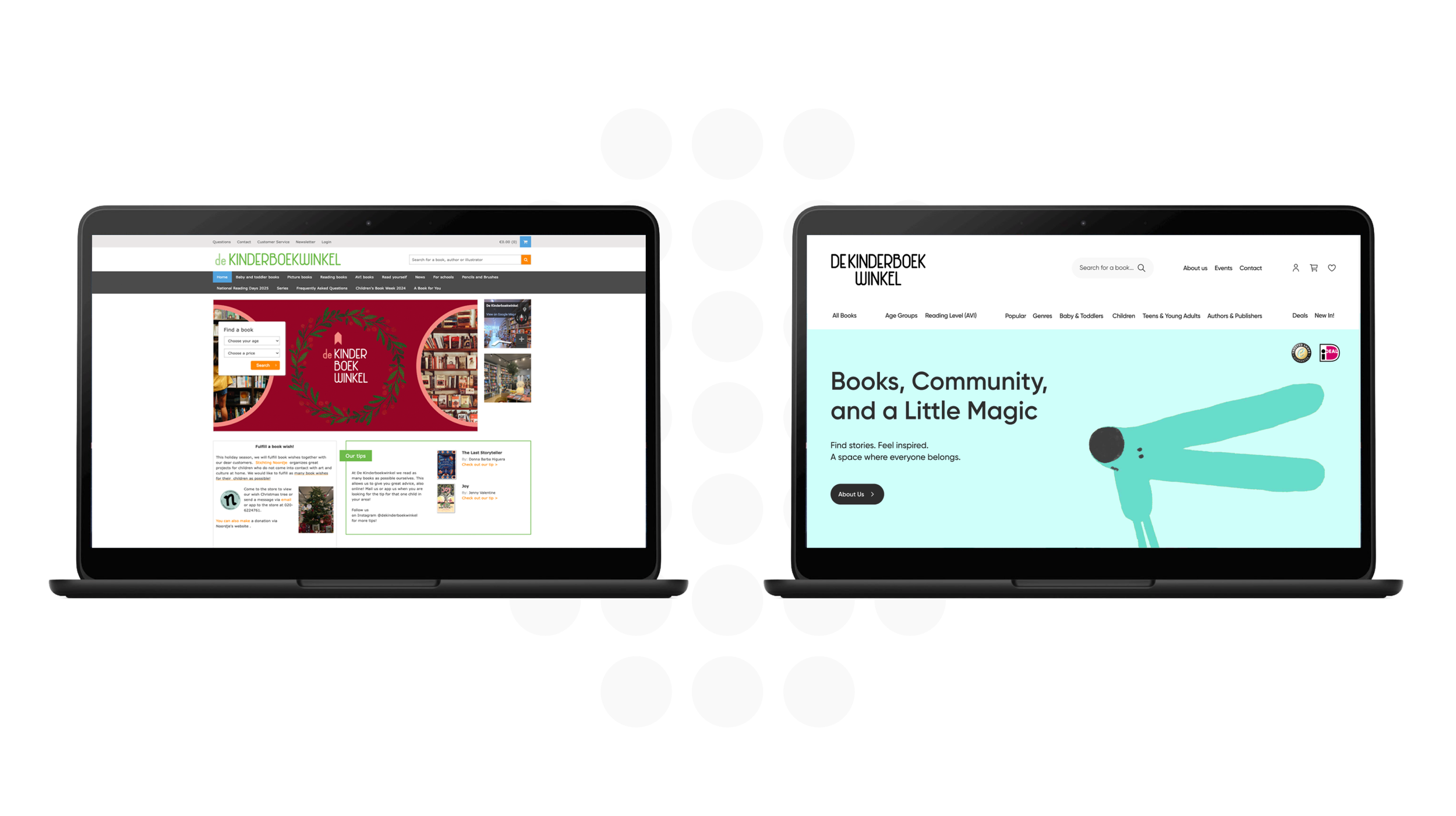
Site Map Previous Site
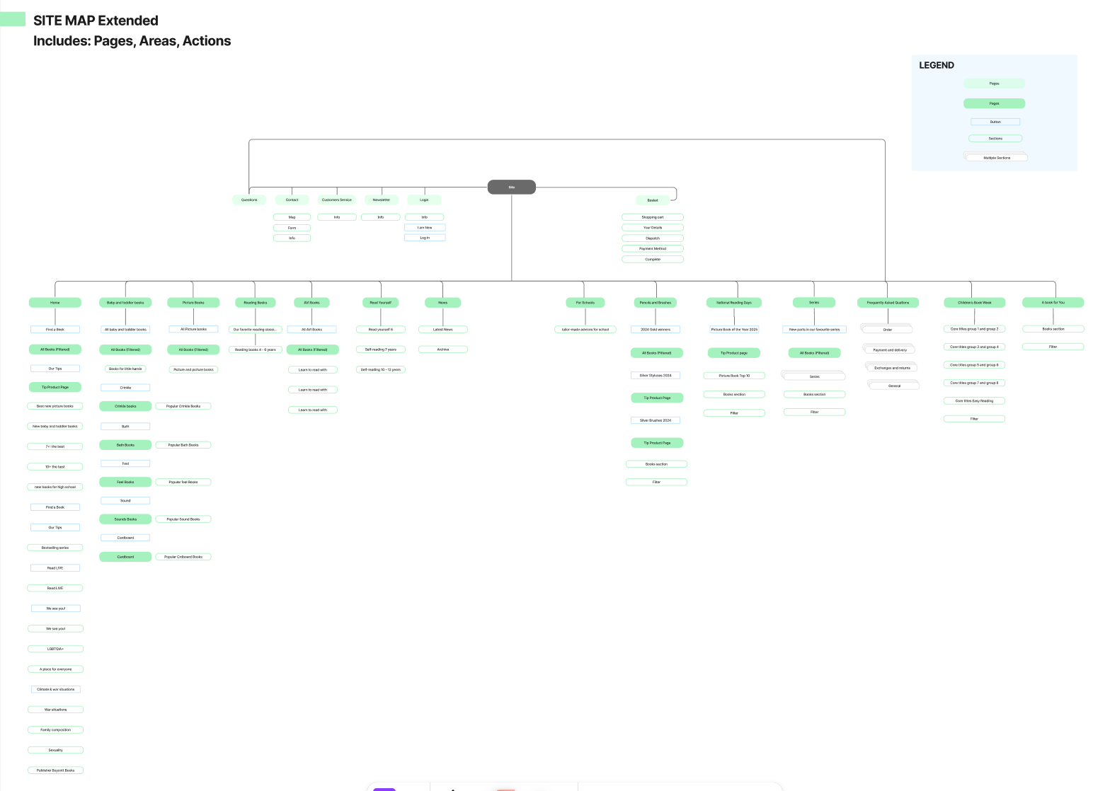
Before, users got lost in a maze of menus and pages.
New User Flow
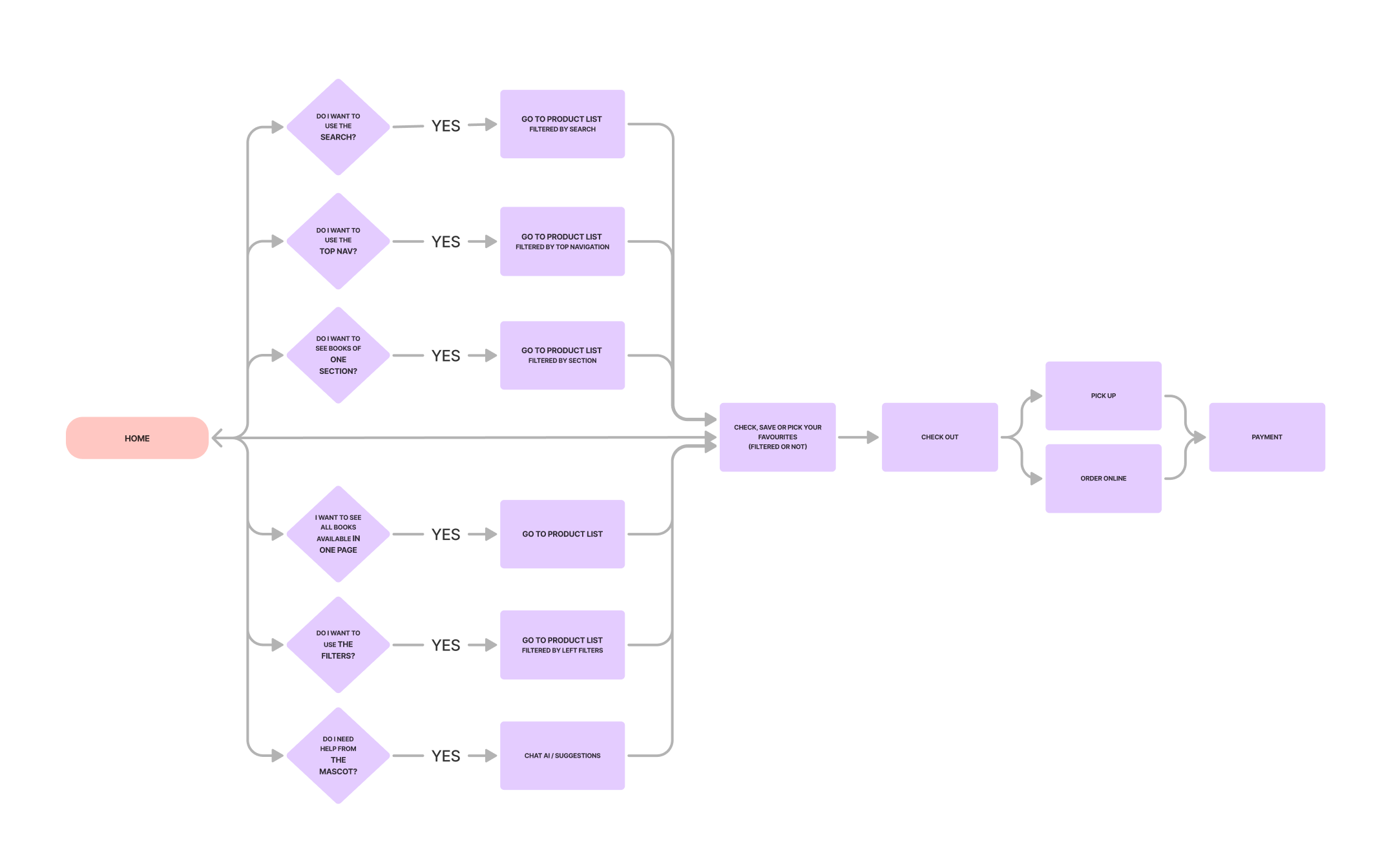
There’s a place where users can easily explore all their magical books — no more getting lost searching.
Every feature was crafted around user needs, combining strategic thinking with thoughtful design, from interactive product cards to personalised deals, to deliver an exceptional experience. See all on the Deliver Phase Below!

Deliver Phase

Let’s see how every element of the design has been shaped around user needs
The curated Top Bar Menu
Users told us the original top bar felt illogical — getting to the right book meant juggling filter pages, side panels, and search bars all at once. Every item in the new menu fixes a specific pain: "All Books" as the always-visible anchor, age group and reading level for the most time-sensitive need, broad age ranges for faster browsing, and Authors, Publishers, Deals, and New In for habits users explicitly relied on. Bookshop information — About, Events, Contact — moves to a separate upper bar, keeping the main navigation focused on finding books.
The Dropdown Menu
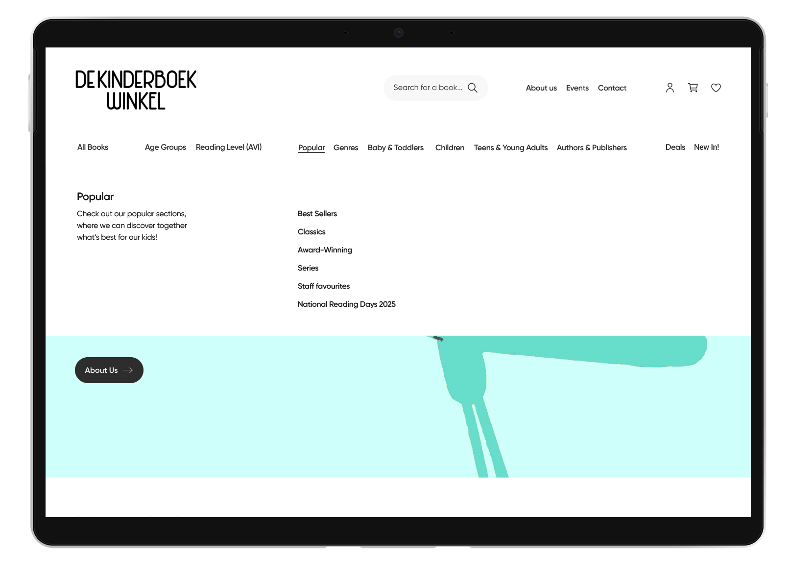
Each menu item opens on hover — clean, white, uncluttered — so users can preview options without committing to a click.
A short description guides each section without overwhelming, and Popular is curated around how users actually discover books,
not generic categories.
New In
New In comes first because both new and returning users told us it's the first thing they look for — it signals the shop is alive, curated, and worth coming back to. Users can scroll horizontally to browse or click through to the All Books section filtered by New In for the full view. Delivery cost and return information sits visibly within the section — a deliberate choice, as research showed users often distrust smaller shops on reliability and speed, and making that information upfront removes a key barrier to purchase.
The Filter Menu
The filter menu is the most critical part of the experience — and the most detailed by design. Filters were weak or missing across every competitor, and users lose time fast without them. A parent wants exactly what their child needs. A teacher wants books by age and reading level. Every filter its extremely curated and exists because users told us it was essential. The site also remembers your last search and filters, so returning users pick up exactly where they left off, no starting over.
Deals and Staff Picks
Research showed users couldn't find discounted books on the original site — there was no dedicated section for it — and unexpected delivery costs were a barrier to purchase. Deals fixes both. Staff Picks came straight from what users loved most: competitor analysis showed curated lists helped parents and caregivers make confident choices, and usability testing confirmed it — "LOVE the Staff Picks!" was the reaction. The Kinderboekwinkel's biggest asset is its expert, human guidance. This section brings that in-store feeling online.
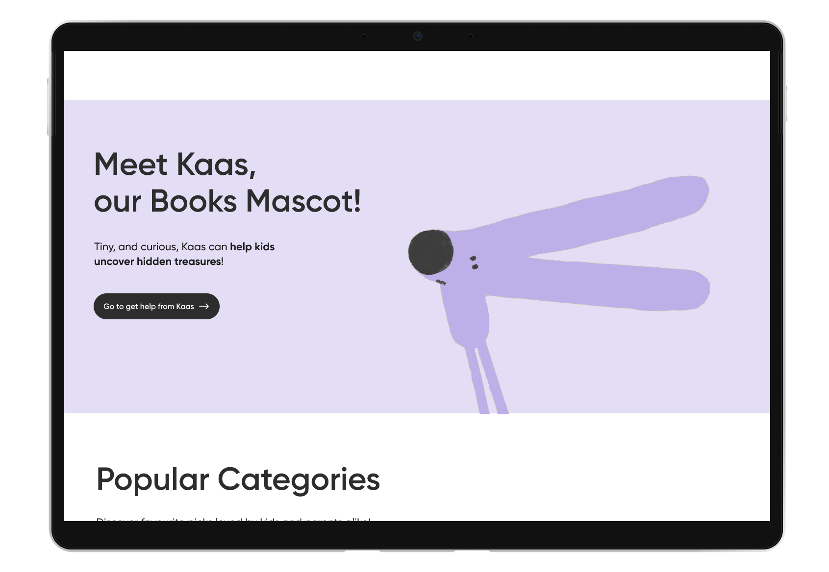
Meet Kaas, the AI Book Expert
Users told us kids needed their own guide — someone to help them explore and discover books in a way that felt fun, not overwhelming. Kaas, the mouse mascot, is exactly that: a playful AI companion that accompanies kids and teens through the bookshop, helping them find their next great read. Magic and usefulness, in one tiny mouse.
Popular Categories, Events & Share
Users told us they want to support local shops — but only when the experience feels as engaging as bigger retailers. Competitors were criticised for feeling transactional and lacking community. This section closes the site the way the physical shop feels: warm, alive, and connected. Events show the shop has a life beyond selling. Sharing spreads the magic.
Clear & Reassuring Checkout Experience
The checkout experience is designed to feel clear and reassuring. Users can quickly browse three large preview images, read or leave reviews, and still access key tabs like age group, new arrivals, and staff favourites to help confirm their choice.
The page also highlights premium discounts, format details, and delivery options such as click & collect or home delivery, followed by a more detailed synopsis section further down the page.