
Holland Casino
re-branding
How to change the perception of a Casino. The client asked us to redesign the brand look to be young, fun, multicultural and dynamic. We started with the modernisation of the logo to the creation of a colorful 'logo inspired' pattern to be used for the whole communication. The pattern reminds confetti shapes in order to give a playful feel as well as representing the endless possibility of gaming, which also has to be approached responsibly. Confetti are great to play with but you cannot control where they fly.
The re-branding widely explored the whole Casino experience. We created the design identity for print and web, followed by the campaign. We art directed the shoots and
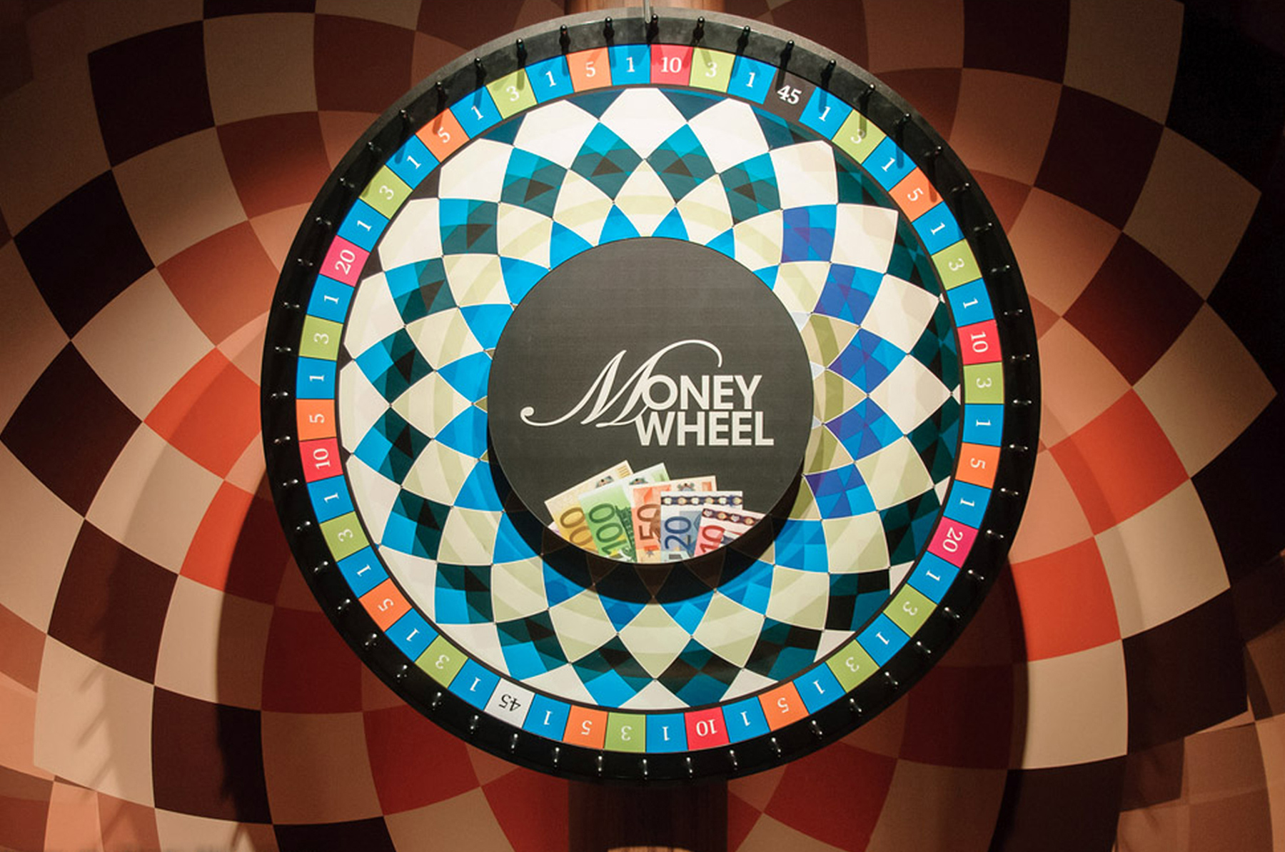
re-designed the most famous game machines such as the Money Wheel and Roulette. We also made over the 14 Casinos based in Holland including big scale posters, wall-papers, carpets as well us their complete refurbishment.


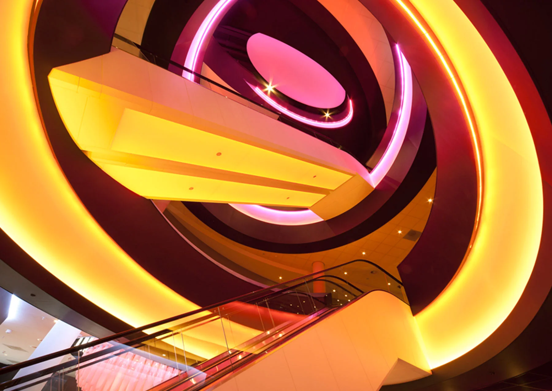


The aim was to transform the Casinos to a 'young feel' place to go have fun with friends, but also have a glass of wine, a chat or listen to a live concert, surrounded a marvelous design and a creative environment. We worked with a team of Graphic Designers, Interior Designers, Architects, Engineers, and Photographers. My role as a Graphic Designer was to create the brand communication making sure to have consistency throughout, as well as being the responsible of the Eindhoven Casino's look and feel. I worked with a team of four graphic designers led by Frank O. Born, Director of Sinot Branding and Design.